CSSでチェックボックスアニメーション
CSSだけでシンプルなアニメーションのチェックボックスを実装する簡単なサンプルコードを記述してます。
環境
- OS windows10 64bit
- chrome 86.0.4240.198
サンプルコード
label span:before, label span:after でチェックの形を生成してます。
<style>

		.checkbox_wrap {
		display: table;
		width: 100%;
		background: #37b507;
		border-radius: 3px;
		}
		.checkbox_wrap .checkbox {
			display: table-cell;
			width: 100%;
			height: 150px;
			vertical-align: middle;
			text-align: center;
		}
		label {
			display: inline-block;
			color: #fff;
			cursor: pointer;
			position: relative;
		}
		label span {
			display: inline-block;
			position: relative;
			background-color: transparent;
			width: 25px;
			height: 25px;
			transform-origin: center;
			border: 2px solid #fff;
			border-radius: 50%;
			vertical-align: -6px;
			margin-right: 10px;
			transition: background-color 150ms 200ms, transform 350ms cubic-bezier(0.78, -1.22, 0.17, 1.89);
		}
		label span:before {
			content: "";
			width: 0px;
			height: 2px;
			border-radius: 2px;
			background: #fff;
			position: absolute;
			transform: rotate(45deg);
			top: 13px;
			left: 9px;
			transition: width 50ms ease 50ms;
			transform-origin: 0% 0%;
		}
		label span:after {
			content: "";
			width: 0;
			height: 2px;
			border-radius: 2px;
			background: #fff;
			position: absolute;
			transform: rotate(305deg);
			top: 16px;
			left: 10px;
			transition: width 50ms ease;
			transform-origin: 0% 0%;
		}
		label:hover span:before {
			width: 5px;
			transition: width 100ms ease;
		}
		label:hover span:after {
			width: 10px;
			transition: width 150ms ease 100ms;
		}

		input[type=checkbox] {
			display: none;
		}
		input[type=checkbox]:checked + label span {
			background-color: #fff;
			transform: scale(1.25);
		}
		input[type=checkbox]:checked + label span:after {
			width: 10px;
			background: #37b507;
			transition: width 150ms ease 100ms;
		}
		input[type=checkbox]:checked + label span:before {
			width: 5px;
			background: #37b507;
			transition: width 150ms ease 100ms;
		}
			input[type=checkbox]:checked + label:hover span {
			background-color: #fff;
			transform: scale(1.25);
		}
		input[type=checkbox]:checked + label:hover span:after {
			width: 10px;
			background: #37b507;
			transition: width 150ms ease 100ms;
		}
		input[type=checkbox]:checked + label:hover span:before {
			width: 5px;
			background: #37b507;
			transition: width 150ms ease 100ms;
		}

	</style>

	<div class="checkbox_wrap">
		<div class="checkbox">
		    <form>
				<div>
					<input type="checkbox" id="check" name="check" value="" />
					<label for="check">
					<span></span>Checkbox
					</label>
				</div>
		    </form>
		</div>
	</div>
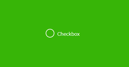
結果
ブラウザ上で表示した結果
-
前の記事
Nuxt.js ライブラリ「vue-englishdatepicker」をインストールして日付ピッカーを実装する 2020.12.23
-
次の記事

node.js 少数の切り捨てを行う「Math.floor」と「~~」と「|」のパフォーマンスを計測する 2020.12.23