CSS Duotone Generatorの使い方
「Duotone」は「Duo(2つの)」+「tone(色)」をあわせた言葉で、ベースとなるミドルトーンとハイライトカラーの2色で描かれた画像のこと。
数年前から流行っていますが、最近ではデザインとして定着しています。
そんなDuotoneカラーを画面を見ながら選択して最後にCSSを書き出してくれる「CSS Duotone Generator」の使い方を紹介しています。
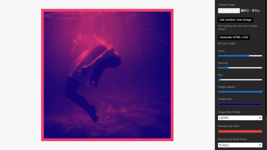
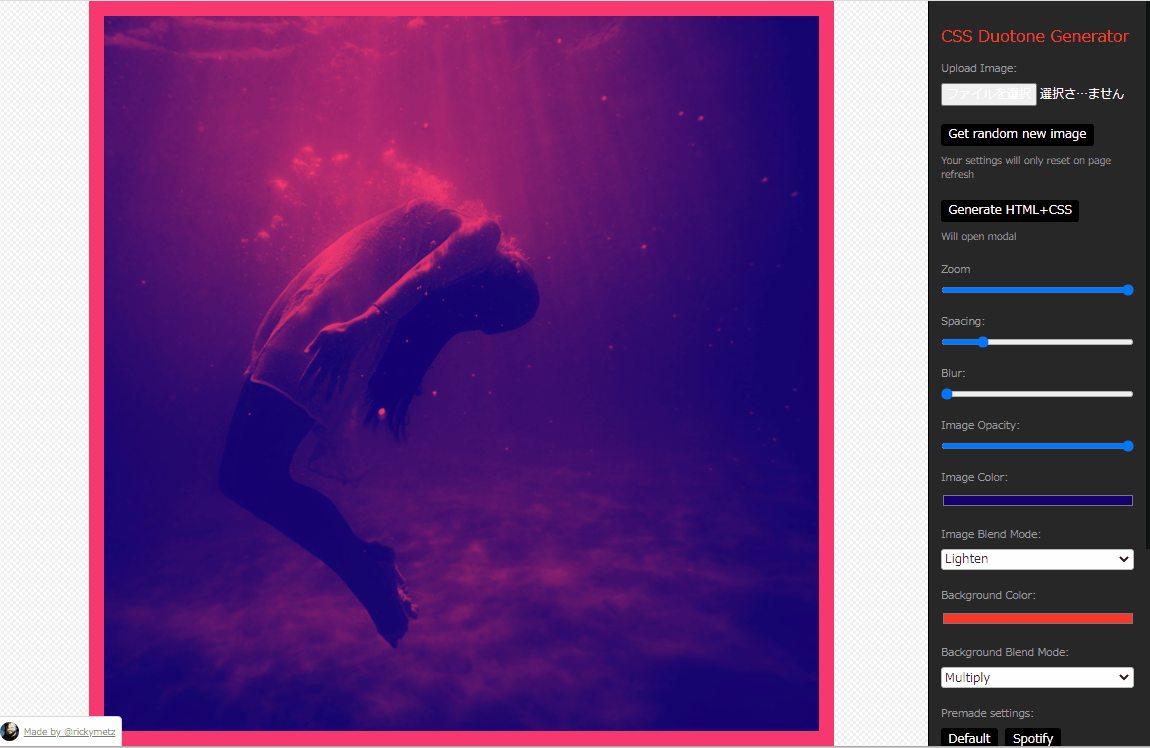
CSS Duotone Generator
「CSS Duotone Generator」のサイトはこちら https://cssduotone.com/
CSS Duotone Generatorはオンライン上ですぐに使用が可能です。会員登録などもありません。
CSS Duotone Generatorの使用方法
画像のアップロード、zoom、Spacing(余白)、Blur(ぼかし)、Image Opacity(画像透明度)、Image Color(イメージカラー)とBackground Color(背景色)の選択、また各色のモードが選択できます。
色の組み合わせとして、「Default」、「Spotify」、「Vintage」、「Blade Runner」、「Law & Order」、「Moody」、「Ursula」、「Random」の8種類のプリセットも用意されています。
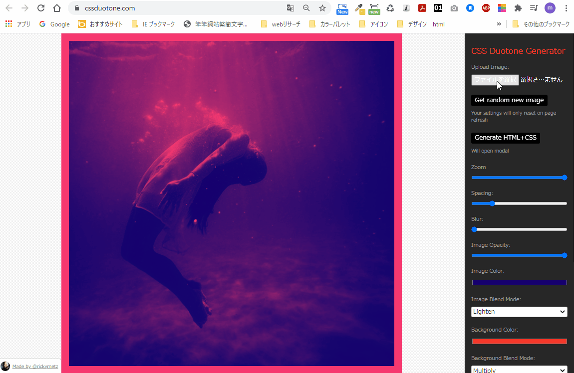
使用方法はこのような感じです
HTML+CSSの書き出し
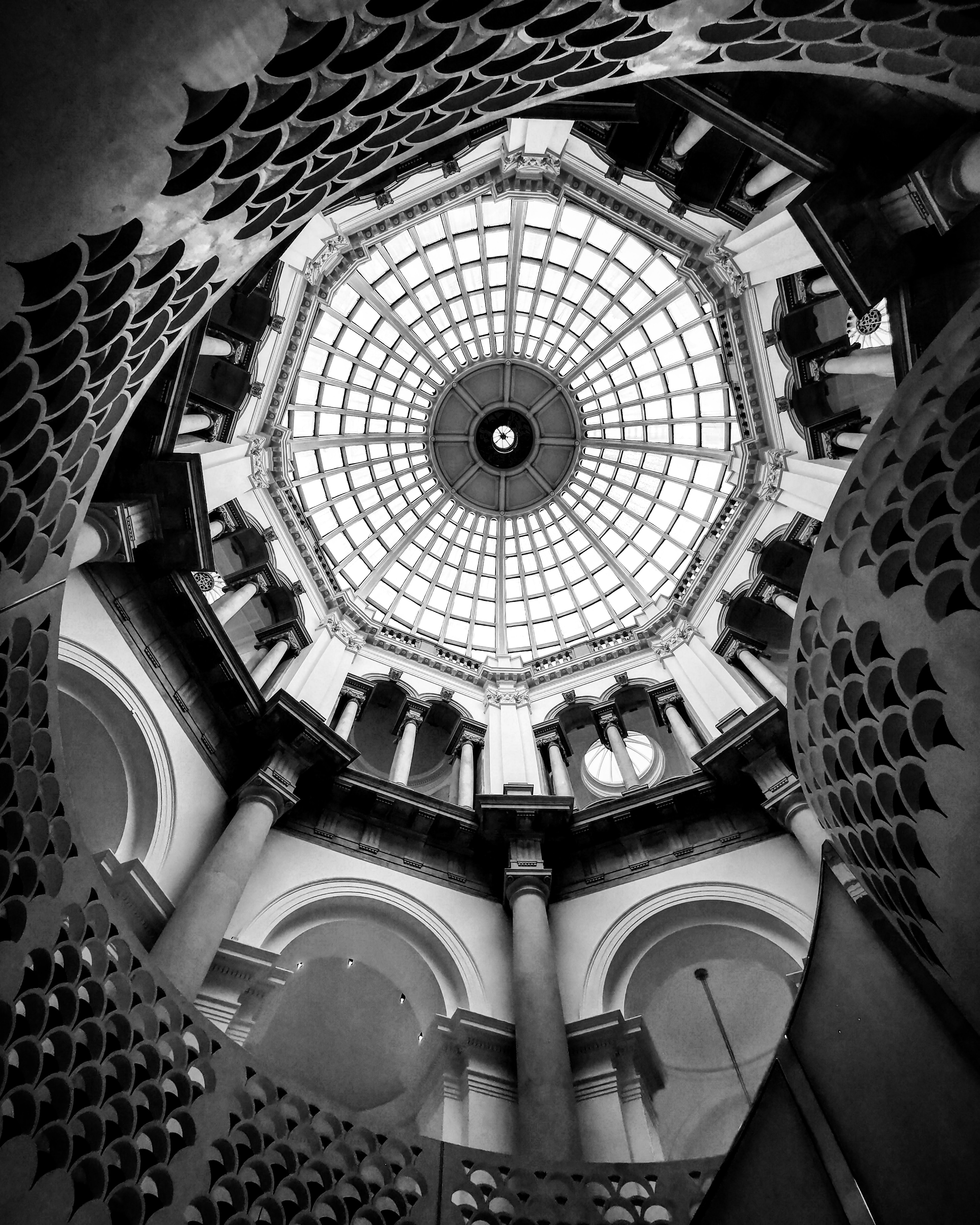
今回は用意した画像をPANTONEが発表した2021年のトレンドカラーの、「Ultimate Gray(アルティメットグレイ)#939597」と「Illuminating(イルミネイティング)#F5DF4D」のDuotoneカラーに設定して、HTML+CSSの書き出しをしてみます。
書き出したソースコード
画像のソースコードだけは手動で変更しないといけないようなので、手動で変更します。
<!-- Styles. Can be included in an external stylesheet  -->

<style>
/* CSS variables. Not needed for the effect to work. */
:root {
  --base:              #939597;
  --bg-blend:          unset;
  --blur:              0px;
  --fg-blend:          multiply;
  --foreground:        #f5df4d;
  --opacity:           1;
  --spacing:           1%;
}
.img-wrapper {
  background-color:    var(--base);
  display:             flex;
  flex:                1 1 100%;
  height:              100%;
  overflow:            hidden;
  padding:             var(--spacing);
  position:            relative;
}

.img-wrapper img {
  filter:              grayscale(100%) contrast(1) blur(var(--blur));
  flex:                1 0 100%;
  height:              100%;
  max-width:           100%;
  mix-blend-mode:      var(--bg-blend);
  object-fit:          cover;
  opacity:             var(--opacity);
  position:            relative;
  width:               100%;
}

.img-wrapper::before {
  background-color:    var(--foreground);
  bottom:              0;
  content:             '';
  height:              100%;
  left:                0;
  mix-blend-mode:      var(--fg-blend);
  position:            absolute;
  right:               0;
  top:                 0;
  width:               100%;
  z-index:             1;
}

</style>
<!-- HTML Markup -->

<!-- You should think of `img-wrapper` as the image itself. This element is what you should target for sizing/styling. -->
<div class="img-wrapper">
  <!-- The `::before` pseudo-element will apear here in the Broweser(DOM) and in web-inspector. -->
  <!-- この画像名だけ自分で変更します。
<img src="https://picsum.photos/1000?image=874">  -->
<!-- 画像名変更 -->
<img src="https://mebee.info/wp-content/uploads/2021/01/max-letek-VSoOoJi8Fi0-unsplash-scaled.jpg">
</div>
ブラウザ上で表示した結果
(max-widthのみ追加していますが上のコードで表示しています)

元画像はこちら
-
前の記事
React.js ライブラリ「react-modern-drawer」を使ってナビゲーション・ドロワーを使用する 2021.01.21
-
次の記事
rails6 Controllerでデバックする 2021.01.22