React.js ライブラリ「react-spring」を使用してフェイドアウェイアニメーションを作成する
- 作成日 2020.03.12
- 更新日 2020.07.22
- React
- react-spring, React.js, ライブラリ
ライブラリ「react-spring」をインストールすると、フェードイン等のアニメーションの実装が簡単に可能です。ここでは、react.jsでreact-springを利用するための手順と簡単な使い方を記述してます。
環境
- OS CentOS Linux release 8.0.1905 (Core)
- node V12.13.1
- npm 6.14.2
- React 16.13.0
react.js環境構築
下記のコマンドで構築してます。ここでは、react-appという名前でプロジェクトを作成してます。
create-react-app react-appreact-springインストール
作成したプロジェクトに移動して、インストールします。
## 作成したプロジェクトに移動
cd react-app

## インストール
npm install react-spring
react-spring使い方
srcディレクトリにsample.jsと名前で下記のコードを記述します。
import React from 'react';
import {useSpring, animated} from 'react-spring'

export const Sample = () => {
    const props = useSpring({
        to: [{opacity: 1, color: '#ffaaee'}, {opacity: 0, color: 'rgb(14,26,19)'}],
        from: {opacity: 0, color: 'red'}
    })

    return (
        <animated.div style={props}>フェイドインします</animated.div>
    )
  }


export default Sample
次に、srcディレクトリ配下にあるApp.jsを下記のように編集します。
import React from 'react';
import Sample from './sample';
import './App.css';

function App() {
  const style = {
    width: "50%",
    margin: "0 auto",
    marginTop: 150
  };
  return (
    <div className="App">
      <div style={style}>
        <Sample />
      </div>
    </div>
  );
}

export default App;
実行します。
npm startブラウザから http://プライベートIP:3000にアクセスすると、フェードインアニメーションが実装されていることが確認できます。
次に画像にアニメーションをかけてみます。
sample.jsを下記の通りに編集します。
import React from 'react';
import { useSpring, animated } from 'react-spring'
import './styles.css'

const calc = (x, y) => [-(y - window.innerHeight / 2) / 20, (x - window.innerWidth / 2) / 20, 1.1]
const trans = (x, y, s) => `perspective(600px) rotateX(${x}deg) rotateY(${y}deg) scale(${s})`

export const Sample = () => {
    const [props, set] = useSpring(() => ({ xys: [0, 0, 1], config: { mass: 5, tension: 350, friction: 40 } }))

    return (
      <animated.div
        class="card"
        onMouseMove={({ clientX: x, clientY: y }) => set({ xys: calc(x, y) })}
        onMouseLeave={() => set({ xys: [0, 0, 1] })}
        style={{ transform: props.xys.interpolate(trans) }}
      />
    )
  }


export default Sample
次にsample.js同一階層であるsrc配下に下記の内容でstyles.cssを作成します。
html,
body,
#root {
width: 100%;
height: 100%;
margin: 0;
padding: 0;
background-color: white;
}
body {
font-family: -apple-system, BlinkMacSystemFont, avenir next, avenir, helvetica neue, helvetica, ubuntu,
roboto, noto, segoe ui, arial, sans-serif;
background: transparent;
-webkit-touch-callout: none;
-webkit-user-select: none;
-khtml-user-select: none;
-moz-user-select: none;
-ms-user-select: none;
user-select: none;
cursor: default;
}
#root {
display: flex;
align-items: center;
justify-content: center;
overflow: hidden;
background: #f0f0f0;
}
.card {
width: 45ch;
height: 45ch;
background: grey;
border-radius: 5px;
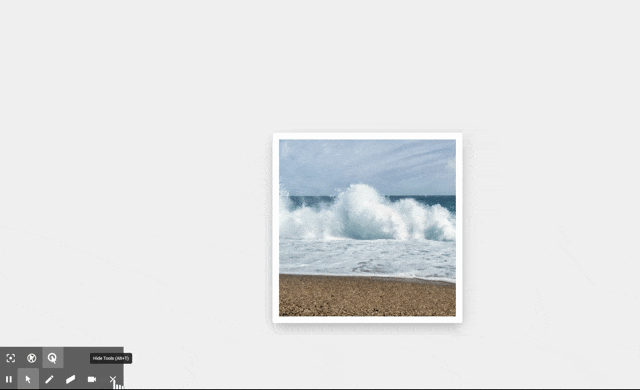
background-image: url(https://cdn.pixabay.com/photo/2020/03/03/15/47/landscape-4899037_1280.jpg);
background-size: cover;
background-position: center center;
box-shadow: 0px 10px 30px -5px rgba(0, 0, 0, 0.3);
transition: box-shadow 0.5s;
will-change: transform;
border: 15px solid white;
}
.card:hover {
box-shadow: 0px 30px 100px -10px rgba(0, 0, 0, 0.4);
}
ブラウザから http://プライベートIP:3000にアクセスすると、エフェクトのかかった画像が実装されていることが確認できます。
-
前の記事
Ubuntu19.10 php7.4をインストールする 2020.03.11
-
次の記事
Growiをインストールする 2020.03.12