React.js ライブラリ「react-nice-dates」を使用してデザイン性の高いカレンダーを制作する
- 作成日 2020.03.10
- React
- react-nice-dates, React.js, ライブラリ
ライブラリ「react-nice-dates」をインストールすると、デザイン性の高いカレンダーを制作が簡単に可能です。ここでは、react.jsでreact-nice-datesを利用するための手順と簡単な使い方を記述してます。
環境
- OS CentOS Linux release 8.0.1905 (Core)
- node V12.13.1
- npm 6.14.1
- React 16.13.0
react.js環境構築
下記のコマンドで構築してます。ここでは、react-appという名前でプロジェクトを作成してます。
create-react-app react-appreact-nice-datesインストール
作成したプロジェクトに移動して、インストールします。
## 作成したプロジェクトに移動
cd react-app

## インストール
npm install react-nice-dates
react-nice-dates使い方
srcディレクトリにsample.jsと名前で下記のコードを記述します。
import React, { useState }  from 'react';
import { ja } from 'date-fns/locale'
import { DatePicker } from 'react-nice-dates'
import 'react-nice-dates/build/style.css'

export const Sample = () => {
    const [date, setDate] = useState()

    return (
        <DatePicker date={date} onDateChange={setDate} locale={ja}>
        {({ inputProps, focused }) => (
            <input
            className={'input' + (focused ? ' -focused' : '')}
            {...inputProps}
            />
        )}
        </DatePicker>
    )
}

export default Sample
次に、srcディレクトリ配下にあるApp.jsを下記のように編集します。
import React from 'react';
import Sample from './sample';
import './App.css';

function App() {
  const style = {
    width: "50%",
    margin: "0 auto",
    marginTop: 150
  };
  return (
    <div className="App">
      <div style={style}>
        <Sample />
      </div>
    </div>
  );
}

export default App;
実行します。
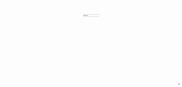
npm startブラウザから http://プライベートIP:3000にアクセスすると、 カレンダー が実装されていることが確認できます。
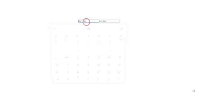
範囲指定も可能です。sample.jsを下記のコードで編集します。
import React, { useState }  from 'react';
import { ja } from 'date-fns/locale'
import { DateRangePicker, START_DATE, END_DATE } from 'react-nice-dates'
import 'react-nice-dates/build/style.css'

export const Sample = () => {
    const [startDate, setStartDate] = useState()
    const [endDate, setEndDate] = useState()

    return (
        <DateRangePicker
            startDate={startDate}
            endDate={endDate}
            onStartDateChange={setStartDate}
            onEndDateChange={setEndDate}
            minimumDate={new Date()}
            locale={ja}
            >
            {({ startDateInputProps, endDateInputProps, focus }) => (
                <div className='date-range'>
                <input
                    className={'input' + (focus === START_DATE ? ' -focused' : '')}
                    {...startDateInputProps}
                    placeholder='Start date'
                />
                <span className='date-range_arrow' />
                <input
                    className={'input' + (focus === END_DATE ? ' -focused' : '')}
                    {...endDateInputProps}
                    placeholder='End date'
                />
                </div>
            )}
        </DateRangePicker>
    )
}

export default Sample
ブラウザから http://プライベートIP:3000にアクセスすると、 範囲が指定できることが確認できます。
-
前の記事

Manjaro Rubyをインストールする 2020.03.10
-
次の記事

chrome 「このウェブページを表示中に問題が発生しました」が突然発生した場合の対処方法 2020.03.10